Projects
Graphic Design Essentials
Our mission at iClicknPrint is to help you customize printable stationary (Geographics Certificates, Envelopes, Business Cards, etc.) quickly and painlessly and to design your projects with ease and the best results.
iClicknPrint offers a great selection of fonts, colors, clip art, shapes, templates and suggested wording but, for those of use looking to create from scratch or to personalize their projects even further, here is the first of a series of 3 blog posts to help you understand more about graphic design and the design process and elements.
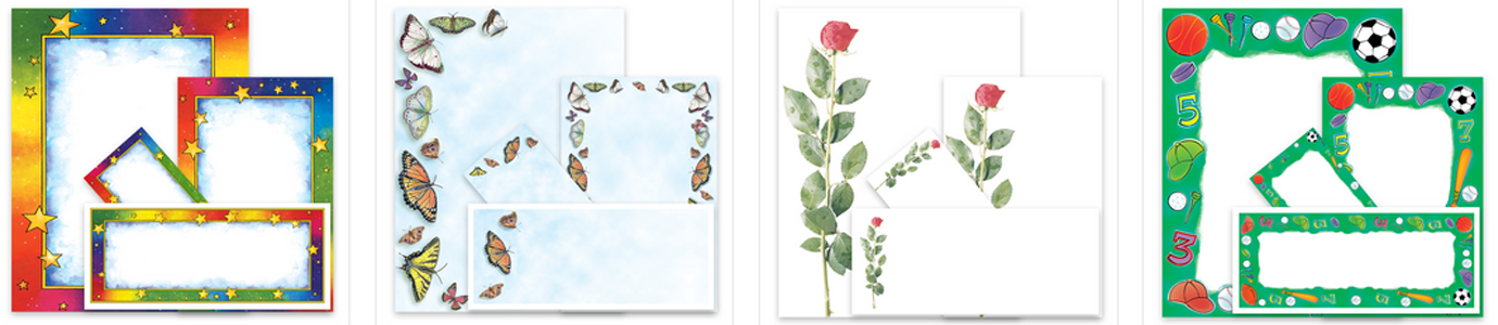
Customize Products in iClicknPrint
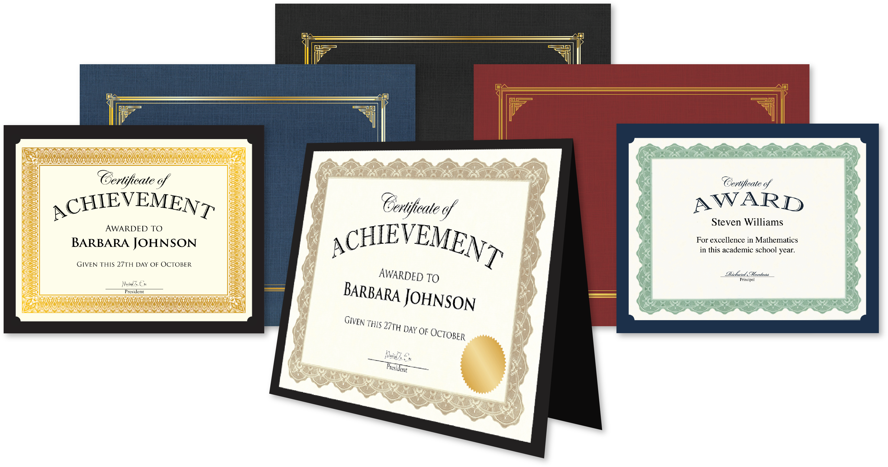
Get Geographics®️ Products
Get Royal Brites®️ Products
We’ll start with the Basic Elements of Graphic Design
• Line • Shape • Texture • Space • Size • Value • Color
Lines
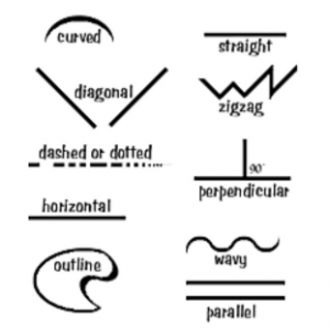
A line is defined as a mark connecting 2 points and it can be straight, curved, fat, thin, squiggly, dashed, patterned, etc.
Shapes
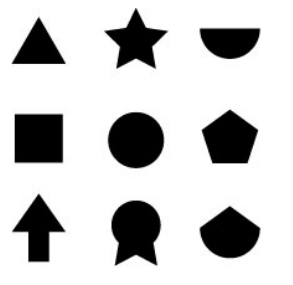
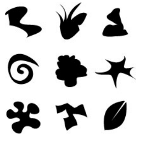
Shapes have height and width and can be divided into Geometric (circles, triangles, squares, etc.), Natural or Organic (animals, plants, humans) and Abstract (icons, stylized figures, graphic illustrations).
Shapes are used to:
- Symbolize an idea
- Highlight information
- Make text or photo more interesting through masking
Angular shapes are considered masculine while curved are more feminine.
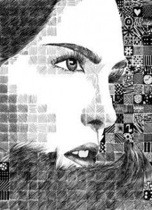
Texture
Texture is the look or feel of a surface. It gives the overall ‘feel’ to something, provokes emotions and adds richness and depth.


Space is the distance around or between things. It separates or unifies, highlights and provides rest for eye. White space is t is the portion of the page left unmarked – the space between graphics, margins and gutters. It is the space between columns, between lines of type or figures and it is especially important because it provides visual breathing room for the eye. It is also often overlooked by beginners so please remember that less is often more and resist cluttering your design.
Size
Size refers to how large or small something is. It adds contrast between elements, it can help create a consistent theme and can be used to give the impression of distance or that something is three dimensional.

Value
Value refers to how light or dark an area is. It is used to:
- Lead the eye
- Create patterns
- Give illusion of volume or depth
- Add drama or Emphasis
- Arrange objects in front or behind each other

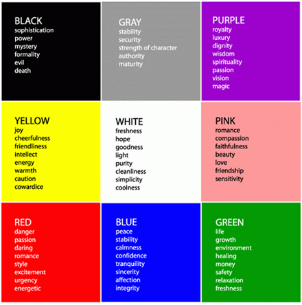
Color
Color is she part of light that is reflected by the object we see. The primary colors are red, yellow, and blue and they are called primary because they are not mixtures of other colors. Color is used to:
- Highlight
- Attract the eye
- Signal importance
- Create mood
- Tie elements together
- Organize, group
- Provoke emotion