Projects
Right Use of Space in Design
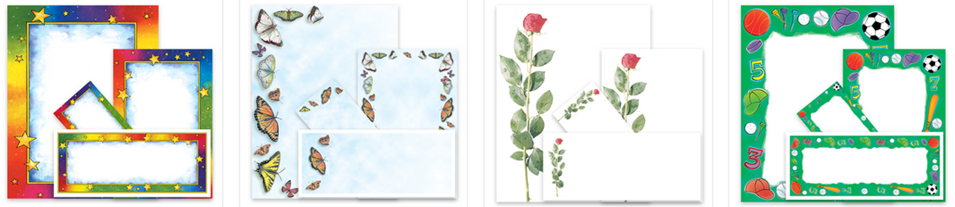
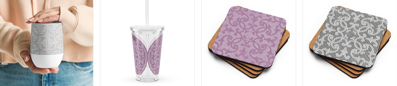
IClicknPrint Design Center is designed to help customers customize Geographics Stationery, Royal Brites Poster Board, Foam or Project Board and Matte or Glossy Photo Paper. Currently, IClicknPrint offers features such as hover over fonts and colors, free clip art, shapes and lines, suggested wording as well as pre-set templates. In addition, we will soon release a non-Flash, HTML version that will make it easier for customers to access and customize printable stationery.
Customize Products in iClicknPrint
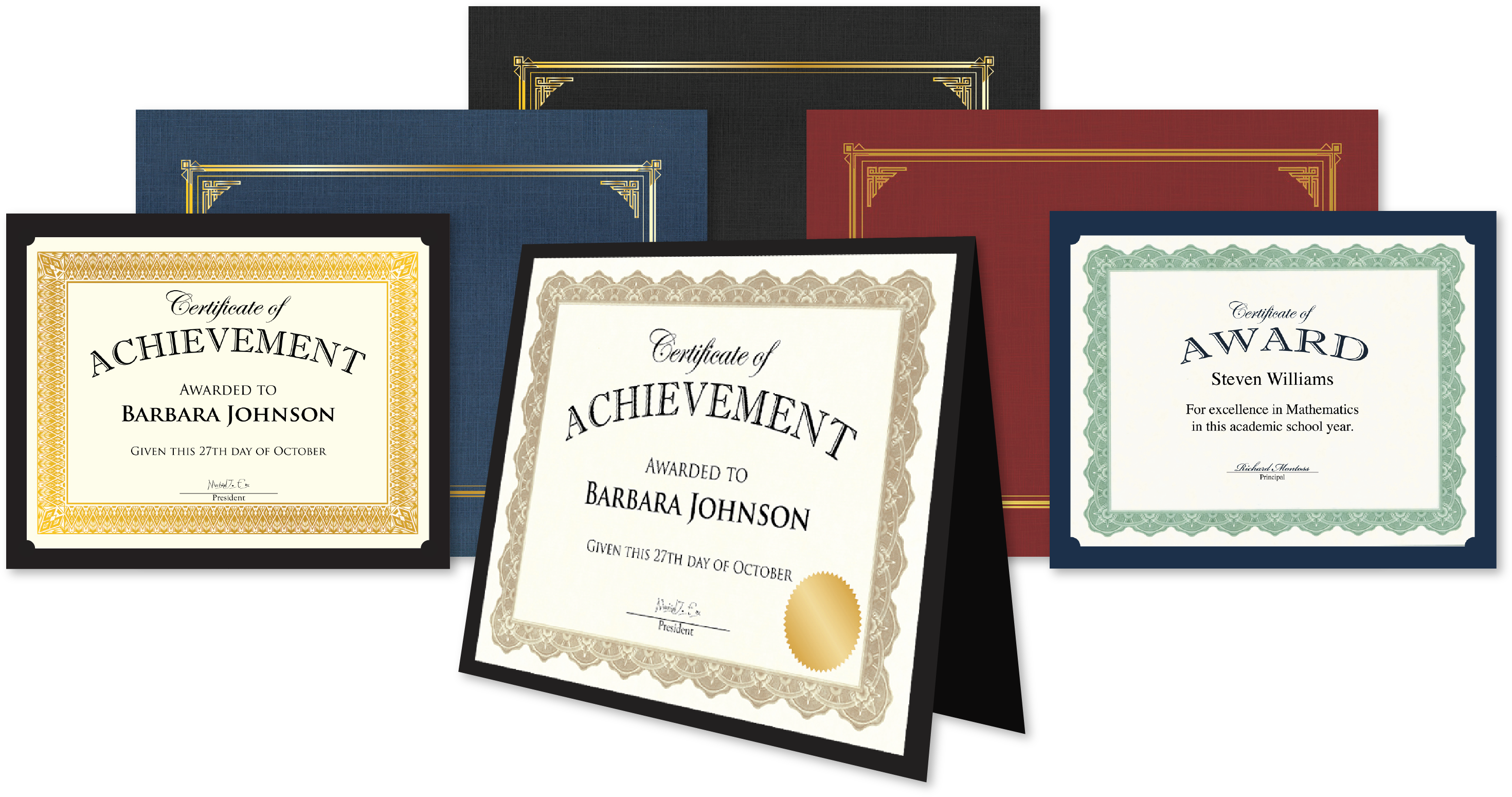
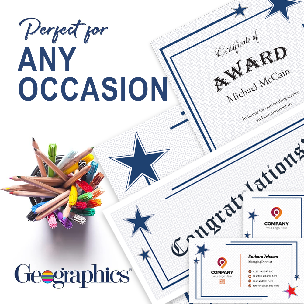
Get Geographics®️ Products
Get Royal Brites®️ Products
Continuing our series on design, in this article we will be focusing on the concept of space. One of the challenges designers generally face, both experienced professionals and beginners, comes from striking the balance between what is essential and what can be left out. So, no matter if you are working on a Poster to promote an event, a Tri Fold Company Brochure or something as simple as Business Cards, you too will need to find that balance.
If you have a tough time cutting down on the quantity of information you want to use in your promotional materials, have a look below at some of the tenets worth keeping in mind:
Ockham’s Razor
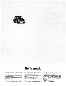
Also known as KISS (Keep It Short and Simple), this principle states that the simplest explanation is usually true. In design, this equates to doing something in the simplest manner possible because simpler is usually better. A famous example of this principle being applied to product design is, of course, Steve Jobs’ philosophy around building simple, sleek and intuitive products.
This is now always an easy task as we often feel that all the information we want to include is equally important. To help the process, create two or three different versions of the message you mean to convey and share it with a colleague or family member. Start with the simplest version and see if they understand the message or if they need more information.
Python philosophy
Derived from ideas presented by Tim Peters in The Zen of Phyton, these tenets include: beautiful is better than ugly; simple is better than complex; sparse is better than dense, readability counts; practicality beats purity; and refuse temptation to guess.
White Space
Many designers believe that white space allows key design elements to breathe and be easily seen. It also helps the viewer to focus attention on them, giving them greater impact.
Text minimization
This suggests that text should be kept to a minimum, with sentences pared back to short, sharp phrases that have a meaningful impact.
Graphic Impact
Graphics should create a visual impact that grabs the attention and reinforces text communication. However, graphics that go overboard and are too large, complicated or numerous are distracting.
TIMTOWTDI (pronounced Tim Toady)
This means simply that “there is more than one way to do it” and follows the belief that a problem may have several different, but equally valid, solutions. So, if you feel stuck or feel that something just isn’t working, start again from scratch and go a different route.
We hope you’ve found these tips useful and that they will help bring out your inner designer – we know you have it in you!
References:
Frank Chimero – The Shape of Design;
Tim Peters – The Zen of Phyton;